Been getting on with my thumbnails exploring more of the cities, I enjoyed these last 4 pages. Most of these cities are quite interesting so it was a lot of fun to imagine them.
First up we have Diomira, from all of the thumbnails I'd say 13 is my favourite. A city with sixty silver domes, that sparked most of the shapes involved with this sheet.
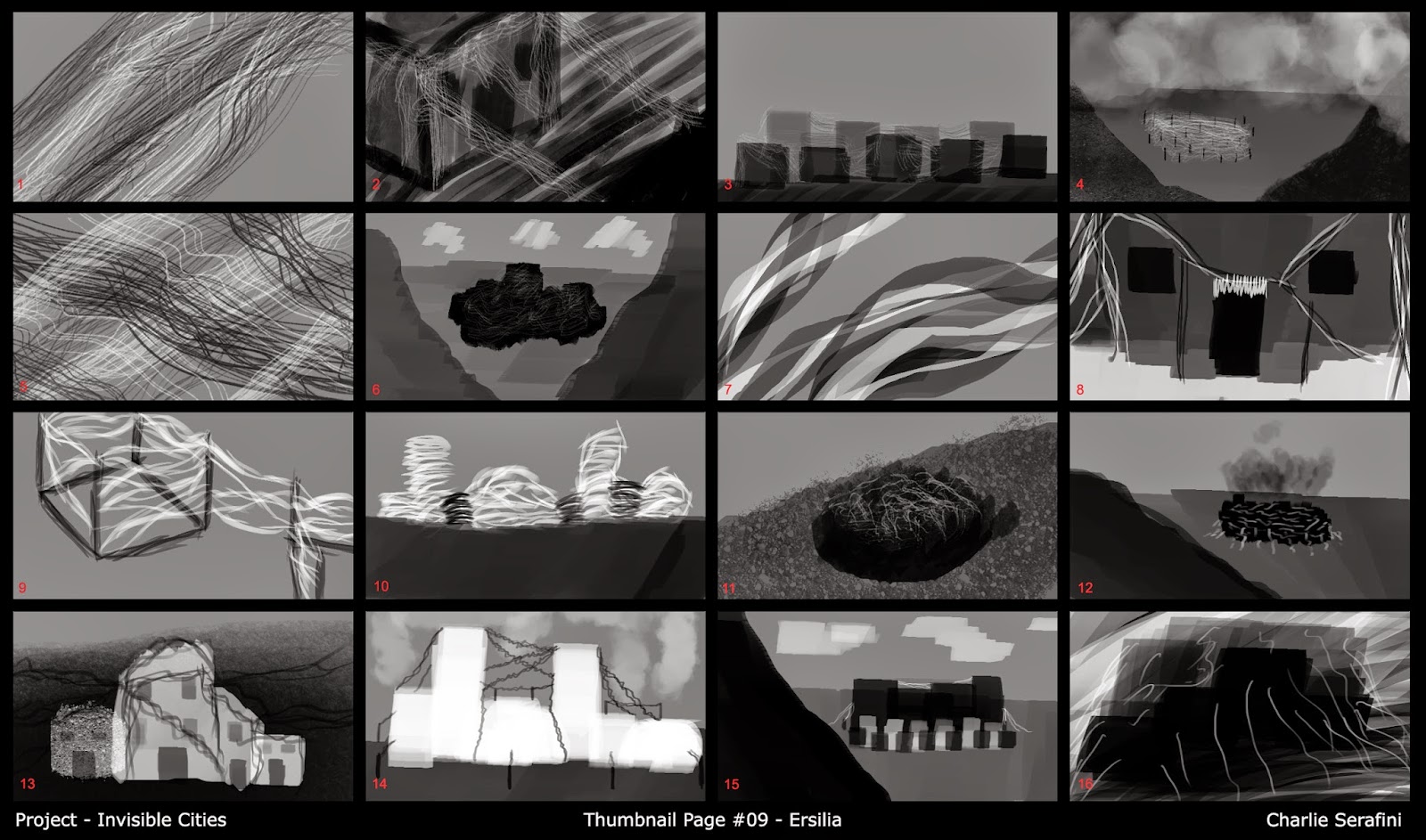
Next we have Ersilia, 6 and 10 are my favourite from this sheet. A city that keeps moving as it becomes impossible to live in due to the stringy labyrinth. I can see in 10 almost the shell of what the city would have looked like. I found this one quite interesting, almost a graveyard for buildings.
Fedora is the next city explored, I like 5 and 12. Most of the influence for these came from the little globes of Fedora's that could have been.
Lastly we have Isaura, 5,6 and 16 are my favourite and I definitely enjoyed this city. I imagined it as quite a dated city, with massive Roman aqueducts, old brick windmills and a very simplistic feeling to it. this could potentially be short listed to the city I want to focus on.
Any and all feedback is welcomed!


Hi Charlie. I really like the Isaura thumbnails. They are all consistent and have a simple, but effective style that looks great. Maybe, add colour to see how that works, but they all look great! Keep it up! :)
ReplyDeleteThank you Dan, I'd probably say that was my favourite page. I'll try to experiment with colour on my detailed thumbnails.
DeleteI agree with Dan! The Isaura ones are really strong. You're starting to use texture without going too over the top with it NICE NICE
ReplyDelete