

Sunday, 28 December 2014
Friday, 26 December 2014
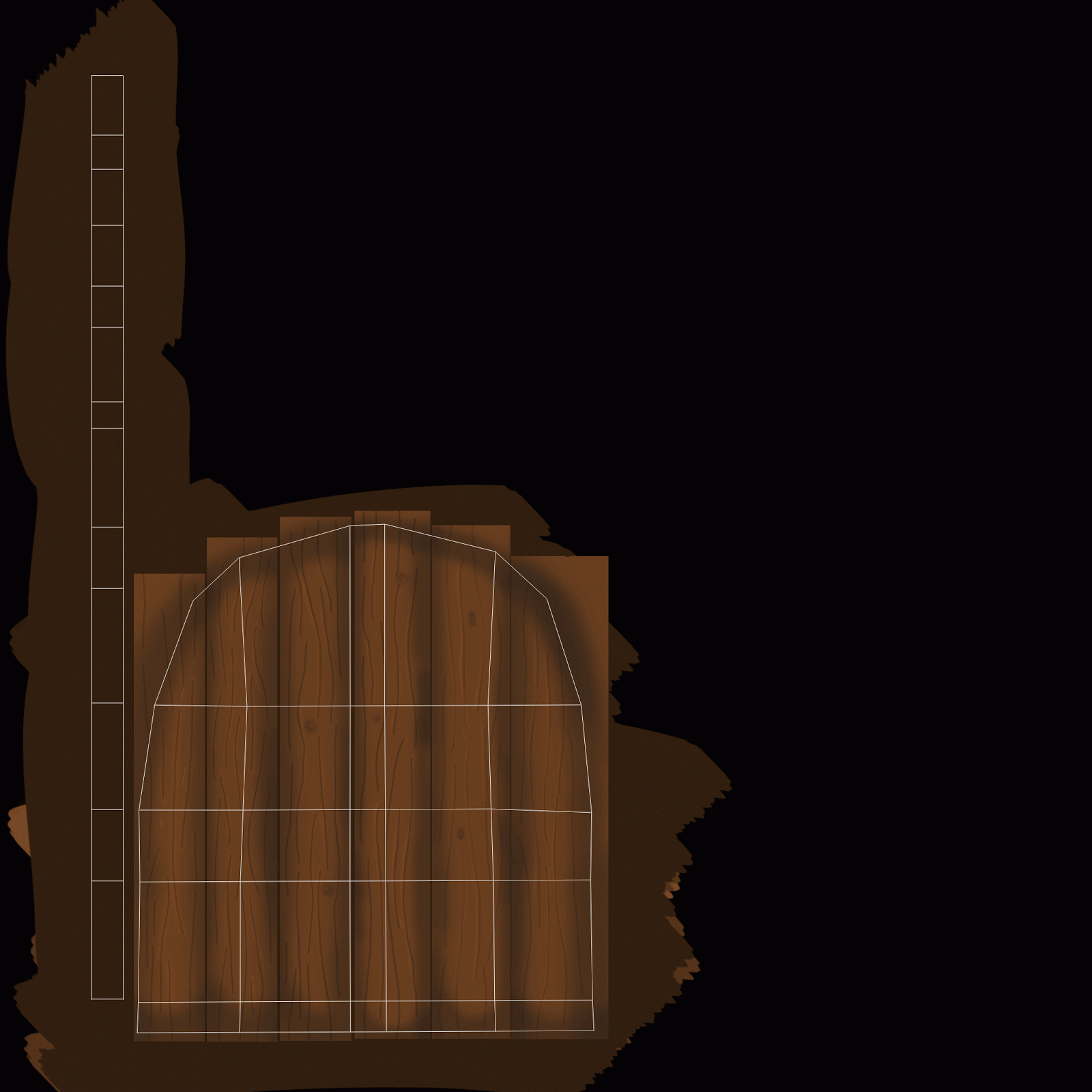
'Beware The Clove & Clementine Goliath!' - Speed Painting Challenge


He's just misunderstood, the poor Goliath is just lonely.
Thursday, 25 December 2014
'The Christmas Cupcake Basilica' - Speed Painting Challenge
I tried to experiment a bit in these speed paints, tried to loosen up a bit and make everything a bit more painterly. I need a lot more practice with it, this is just the starting point.


Tuesday, 23 December 2014

Monday, 22 December 2014

Tuesday, 16 December 2014
Maya Winter Submission
1)
Intro to Autodesk Maya:
a a )
Modelling (NURBS and Polygon) - http://charlieserafini.blogspot.co.uk/2014/09/the-artists-toolkit-egg-cup-modelling.html
b b )
Character Part 1: Modelling - http://charlieserafini.blogspot.co.uk/2014/10/the-artists-toolkit-pencil-and-eraser.html
c c )
Common Shaders - http://charlieserafini.blogspot.co.uk/2014/10/the-artists-toolkit-common-shaders.html
d d )
UV Maps - http://charlieserafini.blogspot.co.uk/2014/10/the-artists-toolkit-texturing-part-2-uv.html
e e )
Character Part2: Texturing and Shaders - http://charlieserafini.blogspot.co.uk/2014/10/the-artists-toolkit-pencil-and-eraser_31.html
f f )
Lights and Shadows - http://charlieserafini.blogspot.co.uk/2014/11/the-artists-toolkit-alien-lighting.html
g g )
Character Part3: Lighting and Rendering - http://charlieserafini.blogspot.co.uk/2014/11/the-artists-toolkit-pencil-character.html
2)
Modelling 1: Digital Sets
a a)
Modelling - http://charlieserafini.blogspot.co.uk/2014/10/the-artists-toolkit-modelling-scene.html
b b)
UV Layout and Texturing Preparation - http://charlieserafini.blogspot.co.uk/2014/10/the-artists-toolkit-old-alley-part-2-uv.html
c c)
Lighting - http://charlieserafini.blogspot.co.uk/2014/11/the-artists-toolkit-old-alley-scene.html
d d)
Colour Maps - http://charlieserafini.blogspot.co.uk/2014/11/the-artists-toolkit-old-alley-scene_12.html
e e)
Bump and Specular Maps - http://charlieserafini.blogspot.co.uk/2014/11/the-artists-toolkit-old-alley-scene_14.html
f f)
Dirt Maps and Final Render - http://charlieserafini.blogspot.co.uk/2014/11/the-artists-toolkit-old-alley-scene_21.html
3)
Lighting and Rendering1: Intro to Lighting
a a)
Exterior Lighting: Midday - http://charlieserafini.blogspot.co.uk/2014/11/the-artists-toolkit-midday-cottage-scene.html
b b)
Exterior Lighting: Sunset - http://charlieserafini.blogspot.co.uk/2014/11/the-artists-toolkit-sunset-cottage-scene.html
c c)
Exterior Lighting: Romantic - http://charlieserafini.blogspot.co.uk/2014/12/the-artists-toolkit-romantic-cottage.html
d d)
Exterior Lighting: Night - http://charlieserafini.blogspot.co.uk/2014/12/the-artists-toolkit-night-cottage-scene.html
4)
Visual FX: Visual Effects 2
a a)
Render Layers: Software - http://charlieserafini.blogspot.co.uk/2014/12/the-artists-toolkit-render-layers-part.html
b)
Depth of Field - http://charlieserafini.blogspot.co.uk/2014/12/the-artists-toolkit-render-layers-part_6.html
Thursday, 11 December 2014
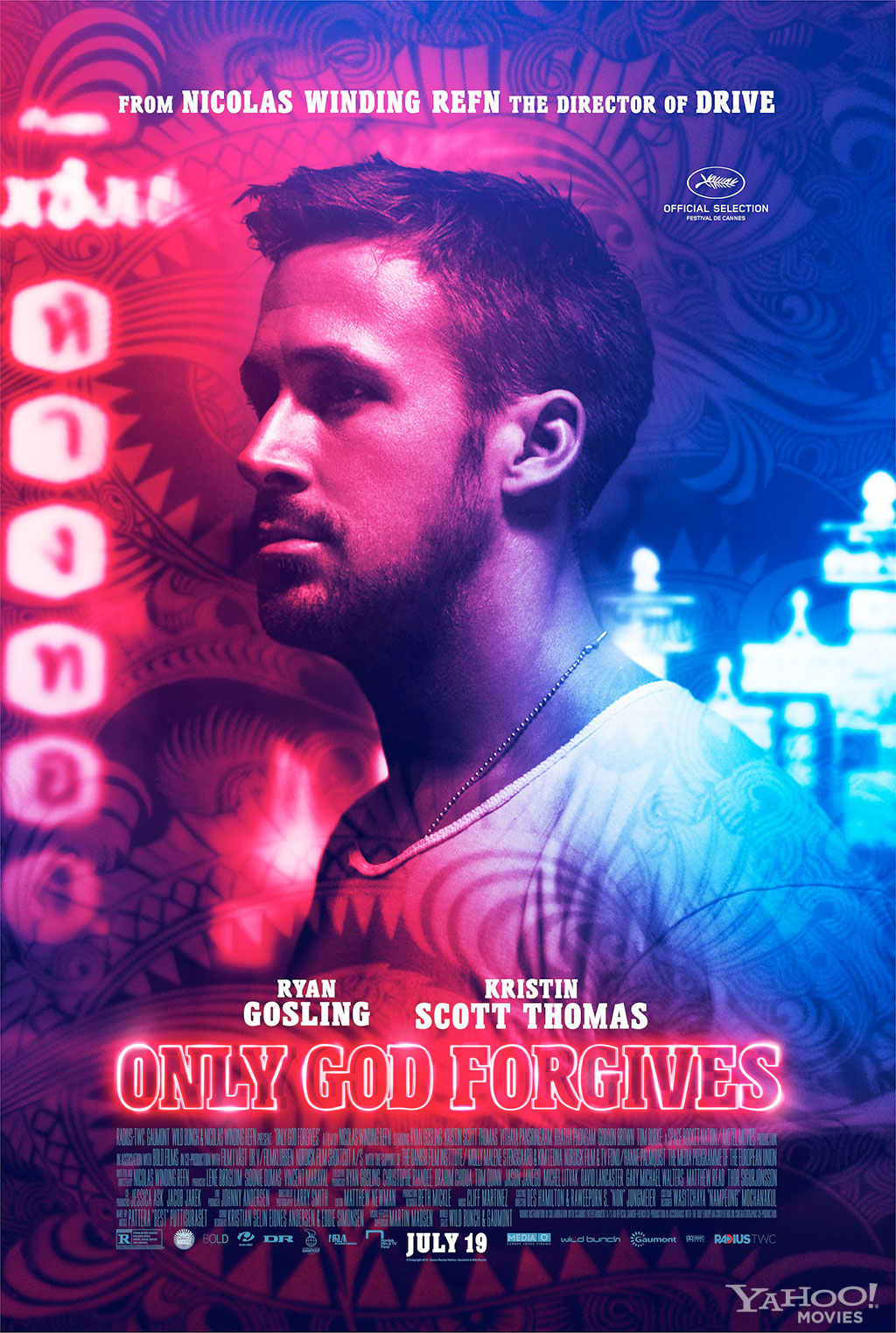
Only God Forgives - Film Review

Fig. 1. Only God Forgives poster.
Nicolas Winding Refn’s Only God Forgives (2013) is an intensely stylized film that lacks a
coherent narrative. Refn uses strong lighting choices to create an environment
that feels out of this world, it’s a shame that the story doesn’t add to the
strong style. It is possible that this is a film that should be mostly viewed
for how beautiful the setting is, even though it’s filled with excessive bloodshed.

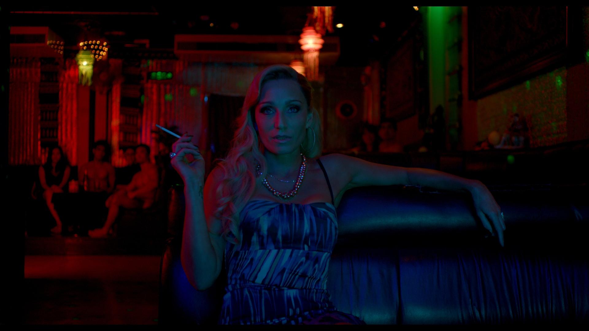
Fig. 2. Lighting still.
Refn creates a world that isn’t what we expect to see, it’s
a highly stylized world that is beautiful to look at. As Sexton points out in
his review ‘Bangkok at night is made to
look infernally coloured, soaked in red and neon.’ (Sexton, 2013). Sexton
notes that Refn fills what is meant to be Bangkok with intense colours like
red, It appears that the colour choices reflect the brutality of the film. The
reds are overpowering at night when acts of rape and murder are happening, the
lighting becomes a true reflection of the twisted minds of the characters that
inhabit the world. Refn uses the stylish world to capture the viewer’s
attention.

Fig. 3. Mother still.
Refn’s environment contradicts the narrative as the
environment is quite immersive, whereas the narrative tries to alienate the
viewer. As Hainline says in his review ‘Only
God Forgives is more about sensory immersion than about character-building or
strict storytelling.’ (Hainline, 2014). Hainline suggest that the
environment is used as an immersive factor, where the characters and narrative don’t
immerse the viewer. The characters are used more to alienate the viewer; with
hardly any dialogue the film relies on its strong visuals to immerse the
viewer.
Another feature of the film that is strong is the
soundtrack, it works well with the strong visuals to make the limited narrative
watchable. ‘Coupled with Cliff Martinez’s
buzzing, lowly pulsating music, it’s distracting and nulling. Yet the lighting,
production design and score are by far the film’s most artful elements.’
(Calhoun, 2013). This suggests that the film itself is held together by its
visuals and the soundtrack. It successfully creates tension when its required
and even helps transition through the narrative.
Overall the films plot is very loose and limited, it
requires highly on its stylised environment to capture the viewer’s attention.
Excessive blood and gore fills the screen as red as the extreme lighting used,
it’s not a film for the faint hearted.
Illustration List:
Refn, N W. (2013). Figure 1. Only God Forgives poster. http://www.heyuguys.com/images/2013/06/Only-God-Forgives-Character-Poster-Ryan-Gosling.jpg
(Accessed on 11/12/2014)
Refn, N W. (2013). Figure 2. Lighting still. http://screenmusings.org/movie/blu-ray/Only-God-Forgives/images/Only-God-Forgives-038.jpg
(Accessed on 11/12/2014)
Refnm, N W. (2013). Figure 3. Mother still. http://www.dewmagazine.com/wp-content/uploads/2013/08/only-god-forgives-7.jpg
(Accessed on 11/12/2014)
Bibliography:
Calhoun, D. (2013). timeout.com. http://www.timeout.com/london/film/only-god-forgives
(Accessed on 11/12/2014)
Hainlin, R. (2014). moivemezzanine.com. http://moviemezzanine.com/laff-the-hainline-diaries/
(Accessed on 11/12/2014)
Sexton, D. (2013). standard.co.uk. http://www.standard.co.uk/goingout/film/only-god-forgives--film-review-8743172.html
(Accessed on 11/12/2014)
What If Metropolis - Final Scene Breakdown
I decided to be a little bit creative with the breakdown of my scene, here's the result.
 1. Break down of the scene


1. Break down of the scene
2. Wireframe
3. Shaded
4. Ambient Occulsion
5. UV Grid
6. Final Scene
What If Metropolis - Revisited Orthographics
I re did my orthographics as Phil had asked in my OGR, I forgot to upload them.


What If Metropolis - Revisted Matte Painting & Final Scene
I got some feedback from Sam on how I could improve my scene, she suggested darken the foreground buildings in my matte painting to better match my scene, here is the result.


What If Metropolis - Matte Painting & Final Scene
I've arranged the final scene now and added in some lighting, I also spent the morning working on my matte painting, I decided to create a plane at the back of my scene and UV map it with a 4k map and then create my matte painting on that. Here's how it's looking


1. Matte painting
2. Matte painting build up
3. Final scene lighting adjustments
4. Final scene
Wednesday, 10 December 2014
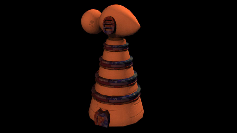
What If Metropolis - Last Tower Textured (woo)
Finished texturing all of the towers now, time to sort out my scene. Here's what it looks like and I also put them all together in Photoshop, they're one happy family.


What If Metropolis - Tower Five Textured
Only one more to texture, then I can focus on the scene. (Cream biscuit windows again.)

What If Metropolis - Tower Six Progress
I've modelled and UV mapped the last tower (woo), just got to texture two now and then I have to sort out the scene.

What If Metropolis - Tower Five Progress
I've now UV mapped tower number five so here's a gif of its progress.

What If Metropolis - Tower Four Textured
Another one down, the ring windows look like oreos to me now (what is seen cannot be unseen!).


Tuesday, 9 December 2014


What If Metropolis - Submission Disc Artwork

I printed my DVD case out today, I've come to realise that product design is one of my weaknesses. So I'm going to invest more time into it and improve upon it in the future.
Monday, 8 December 2014
What If Metropolis - Tower Five Progress
I've now completed the modeling for my fifth tower/building, only one more to model! (woo)


What If Metropolis - Tower Four Progress
I've finished the model for my fourth tower/building now, only two more to go! I'm going to UV this one now and I will try to get it textured tonight at home.

1. Wireframe, shaded and close up of the top of my fourth tower.
I added some planes to the top of my model that will make a lot more sense after I've textured it, if all goes to plan it should make the top spikes look a lot better.
Sunday, 7 December 2014
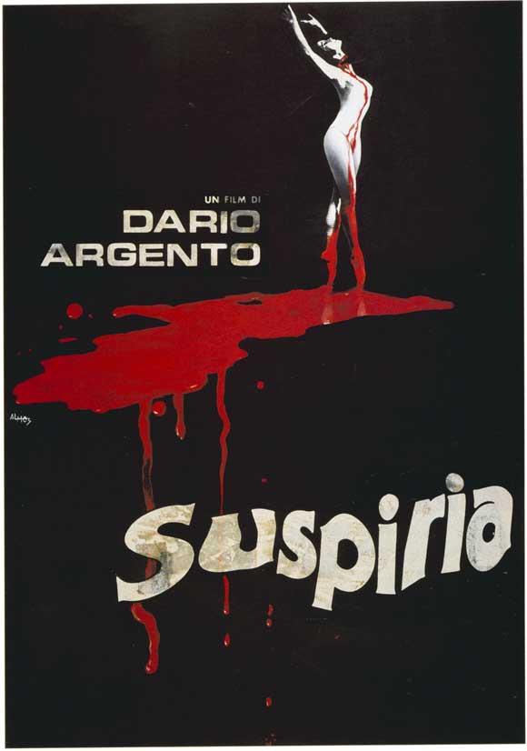
Suspiria (1977) Film Review

Fig. 1. Suspiria poster.
Dario Argento’s Suspiria
(1977) is an Italian horror film that is visually enchanting but evidentially
less focused on the overall plot. It’s got a variety of uncomfortable scenes
which include a guide dog mauling its owner, however overall this is a film
that is very hard not to become absorbed in.

Fig. 2. Red lighting still.
The plot is rather lacking even though it has a strange
twist near the end, however Argento’s use of lighting is what makes this film
visually stunning. As Smith points out in his review of the film ‘And then there's Argento's masterful use of
deep primary colours — the sets are bathed in garish red and green light (he
acquired 1950s Technicolor stock to get the effect) giving the whole film a
hallucinatory intensity.’ (Smith, 2007). Smith suggests that Argento’s use
of overly saturated primary colours gives the film a hallucinatory effect. It
is evident that Argento used such strong colours to mirror what was happening
in the scenes, for example near the end of the film he uses vibrant reds to
compliment the murderous scenes that are taking place.

Fig. 3. Green lighting still.
It is possible that the films ability to capture the
viewer’s attention is mainly successfully due to its strong visual style. As stated
in a Film4 review of the film, ‘Hailed as
a European horror classic, Suspiria's bloody charm resides in its technical
triumphs and visual style.’ (Film4, 2008). This implies that the films
horror is achieved through its style. Argento was able to create a completely
stylized world that still felt and looked convincing, he’s use of strong
colours changed the overall mood of the film and helped create tense and horrific
scenes. It is clear that the films lacking plot is redeemed purely by its
style.
The soundtrack adds a level of tension to the film that
makes it increasingly more scary, a magical melody is screamed as an indication
that something bad is about to happen, it ties in with the plot twist of the
film being about witchcraft. As Vaux points out, ‘The legendary soundtrack from Goblin gets under our skin immediately,
aiming to unsettle us at the fundaments before the movie goes to work on us in
earnest.’ (Vaux, 2014). Vaux suggests that the soundtrack is extremely
effective at creating an uneasy tension from the start and carries on
throughout the film. It is evident that the soundtrack becomes very over
powering, during the film it’s sometimes hard to hear what is actually
happening due to the screech power from the soundtrack. Like many horror films,
the soundtrack gives the viewer a hint to when they should shut their eyes and
expect horrible things to happen.
Overall Suspiria
is an enchanting horror film that will leave you feeling haunted, through its
use of extreme visuals and ear bursting soundtrack. With some scenes that will
never leave your memory, it is definitely a must watch for any horror lover.
Illustration List
Argento, D. (1977). Figure 1. Suspiria poster. http://collider.com/wp-content/uploads/suspiria-poster.jpg
(Accessed on 07/12/2014)
Argento, D. (1977). Figure 2. Red lighting still. http://screenmusings.org/movie/blu-ray/Suspiria/pages/Suspiria-102.htm
(Accessed on 07/12/2014)
Argento, D. (1977). Figure 3. Green lighting still. http://frankzumbach.files.wordpress.com/2011/08/suspiria8_copy0.jpg
(Accessed on 07/12/2014)
Bibliography
Film4. (2008). film4.com. http://www.film4.com/reviews/1976/suspiria
(Accessed on 07/12/2014)
Smith, A. (2007). empireonline.com. http://www.empireonline.com/reviews/reviewcomplete.asp?FID=132659
(Accessed on 07/12/2014)
Vaux, R. (2014). mania.com http://www.mania.com/31-days-horror-suspiria_article_140631.html
(Accessed on 07/12/2014)
What If Metropolis - Tower Two Ambient Occulsion Test
Following my previous post I decided to quickly apply an ambient occlusion texture to the ambient colour channel of each of my materials.
I put it next to the previous render for a comparison, I prefer the model with the ambient occlusion as it brightens it up nicely and gives it a similar warm feel that my previous tower had.

I put it next to the previous render for a comparison, I prefer the model with the ambient occlusion as it brightens it up nicely and gives it a similar warm feel that my previous tower had.
What If Metropolis - Tower Two's Breakdown
I textured my second tower today, I haven't applied an ambient occlusion to it yet but I think I may need to, so it is as bright and vibrant as the first tower.


1. Textures being applied to the model gif.
2. The base diffuse and normal maps.
3. The bottom windows diffuse and normal maps.
4. The door diffuse and normal maps.
5. The door frame diffuse and normal maps.
6. The middle windows diffuse and normal maps.
7. The top windows diffuse and normal maps.
8. The door handle diffuse and normal maps.
9. Production art & model.
I think I'm going to apply an ambient occlusion to the materials and compare the effects, I feel as if its no where near as bright and vibrant as it needs to be.
Subscribe to:
Posts (Atom)