

Wednesday, 26 November 2014
What If Metropolis - Texturing Test
I decided to try texturing the tower that I had started modelling, I made a gif showing the progress. I gave it a very subtle bump map to try and add some extra details.
The Artist's Toolkit - 2 Life Drawing Sessions
I completely forgot to upload last weeks life drawing so I thought I'd upload them with the session we had today.


What If Metropolis - Revisting Production Art (Structures)
I made some alterations to the design of the page as Phil suggested (I hope the font is okay) and I also did another page of them, with 3 more of structures that are in my final scene.


Phil suggested in my OGR that I change one of the foreground buildings as it had a similar shape to the other foreground building. The middle building is the foreground building that will be staying in the scene and I think I might use the building on the right as the other foreground building, as it is a completely different shape and is a bit more unique.
Monday, 24 November 2014
What If Metropolis - Maya Block Out & Modelling Started
Today Jordan advised us to start blocking out our world and to put in some basic lighting to see if the composition worked. So with very basic shapes I blocked out the basic composition, added a directional light with an orange tone and gave all the models an lambert with an ambient occlusion node plugged into the ambient colour channel.

Some elements will end up changing to the tweaks Phil suggested in my OGR, that being said I think the composition has translated quite well.
I also started to model one of the structures today, Jordan suggested I get one building completely done and textured so I can start working out the overall style of the textures.
What If Metropolis - Revisiting Production Art
I've started to re produce my production art (hopefully to a much higher standard). I'm quite happy with this page and will continue to produce the rest like this. These buildings are definitely growing on me the more I draw them, no more generic cubes.

Sunday, 23 November 2014
Roman Polanski's Repulsion (1965) Film Review

Fig. 1. Repulsion poster.
Roman Polanski’s Repulsion (1965) is a disturbing
psychological horror film that is filled with uncomfortable scenes. The
narrative can be quite confusing at times as you aren’t always sure if the scene
you are watching is reality or just a nightmare.

Fig. 2. Ending still
Throughout the
film there are some seriously disturbing scenes that are difficult to watch.
There are a few scenes, in which Carol the main character is raped, As Jenkins
states in his review ‘A church bell handily rings whenever
Carol's virginal sanctity is being invaded’ (Jenkins, 2013). Jenkins points out
that before these horrible scenes of rape occur, a church bell rings. You start
to link the scenes of sexual attack with the sound of the church bell. It’s
possible that Polanski wanted to create that link for the ending, in which it
slowly zooms into a family picture that only has Carol and what appears to be
her father visible, the church bell rings violently. This suggests that Carol’s
father sexual assaulted her and could be the reason behind her fear of men and
sex.
Polanski’s
use of sound is chilling and in some cases the use of little to no sound is
even more effective. As Rosenbaum points out in his review ‘Roman Polanski's first film in English
(1965) is still his scariest and most disturbing—not only for its evocations of
sexual panic, but also because his masterful employment of sound puts the
audience's imagination to work in numerous ways.’ (Rosenbaum, 2007). Rosenbaum
reinforces the point that Polanski’s use of sound is well thought out, he also
suggest that Polanski’s use of sound lets the audience’s imagination do a lot
of the work. This links back in to the use of the church bell being sounded
every time Carol is about to be sexual attack, it also becomes even more
sinister when Polanski cuts the sound from the actual attack scenes. This
leaves the viewer feeling extremely uncomfortable; the only sound that remains
during this time is the sound of clock ticking; Polanski may have used the
sound of clock ticking to intensify the terrifying act.

Fig. 3. Crack still
As the film
progresses you see Carol’s mental state take a turn for the worst, as hysteria
starts to fall in place. Polanski symbolises this very well with the use of
props and scenes of the wall cracking, as Kendrick states in his review ‘As time moves forward, marked by both growth
(a pile of sprouting potatoes on the kitchen counter) and decay (a skinned
rabbit slowly rotting on the table), those cracks start getting larger, and the
strange sounds develop into a cacophony of what sounds like distorted human
screaming.’ (Kendrick, 2009). Kendrick points out that Polanski used the
potatoes growth and the rabbits decay as a symbol for Carol’s mental health. It
is possible that the cracks in the wall may have symbolised other meanings as
well, as they start getting worse when Carol’s sister leaves to go on holiday.
This could mean that they also symbolise the divide between Carol and her
sister (the only person who keeps her sane). The longer her sister is absent
the larger the cracks get, this however could still only derive from her mental
state becoming more and more unstable.
Overall
Repulsion is a chilling film that will leave you haunted from the hysterical
view of a sexual scared individual, with scenes of sexual assault and mental
break downs which is reflected by the environment. It is most certainly a great psychological
horror film that will most definitely create an ever lasting impression.
Illustration
List
Polanski, R.
(1965). Figure 1. Repulsion poster. http://www.eatbrie.com/large_posters_files/Repulsion1.jpg
(Accessed on 23/11/14)
Polanski, R.
(1965). Figure 2. Ending still. https://blogger.googleusercontent.com/img/b/R29vZ2xl/AVvXsEjXoY_NE39Xn-r6yxTveaKnbEn5V4eKdwhcKXym3BPi7fkumKpybHULdghnDQSdlgkdEtwWhxsmKuRiwySLUJt8IGMxPIJ-QBdAE8QQ04iE-yZu13gEDILw982Y_8MN0s2AzNcZueX03nA/s1600/repulsion+photo.jpg
(Accessed on 23/11/14)
Polanski, R.
(1965). Figure 3. Crack still. https://blogger.googleusercontent.com/img/b/R29vZ2xl/AVvXsEgnq4mtWGp2atVI_Lr-P68ysO8YkOplNM3jj5IDTQfXrAt77UpBs9pXNK2AXl1o-JbSgIQPStGd6biL8seoj6T3xcwnv_CFDTnwnXVInjY4yaj1DdfcqhNVUYSZUPx2GFfQ4VBiEN_YfeQ9/s1600/repulsion6.png
(Accessed on 23/11/14)
Bibliography
Jenkins, D.
(2013). littlewhitelies.co.uk. http://www.littlewhitelies.co.uk/theatrical-reviews/repulsion-22822
(Accessed on 23/11/14)
Kendrick, J.
(2009). qnetwork.com. http://www.qnetwork.com/index.php?page=review&id=2252
(Accessed on 23/11/14)
Rosenbaum,
J. (2007). chicagoreader.com. http://www.chicagoreader.com/chicago/repulsion/Film?oid=3130149
(Accessed on 23/11/14)
Saturday, 22 November 2014
The Artist's Toolkit - Zeotrope Animation Progress
I decided to not do something Christmas related for the zeotrope (I'm not a Grinch, I promise), instead I did a witch flying on a broomstick.
The first attempt rendered out strangely, so I had to fix the timing which gave me more frames to play with.
 I then went on to add her hat flying off and disappearing (magical).
 And to finish it off I added colour and a background.

The first attempt rendered out strangely, so I had to fix the timing which gave me more frames to play with.
Wednesday, 19 November 2014
What If Metropolis - Definitive Influence Map and Digital Set Break-down
Here's my definitive influence map for my final concept, I looked at a lot of Gaultiers work and illustrations.

I've also made a plan for how I'm going to model my city. The bulk of it will be modelled with the matte painting in the distance making it feel more vast.

I've also made a plan for how I'm going to model my city. The bulk of it will be modelled with the matte painting in the distance making it feel more vast.
What if Metropolis - Concept Art

My final concept for my city. It is based off of one of the last thumbnails I created (169) and overall I'm quite happy with it. I tried to balance out the warm colours with some blue shadows and I pushed the cityscape back a little bit so it has some more depth.
What If Metropolis - Two More Orthographic Design Sheets
Earlier I finished off the orthographic design sheets that I will require for this project.


Tuesday, 18 November 2014
What If Metropolis - Orthographic Design Sheets
Here are my first 4 orthographic design sheets, I decided to do these before my final concept painting as I thought it may help with the overall design.


I did front, side and top view because when it comes to modelling I'll need a top reference more than I'll need a back reference and seeing as you shouldn't see the back of any of these models it seemed more favourable to create the top view instead.
I did front, side and top view because when it comes to modelling I'll need a top reference more than I'll need a back reference and seeing as you shouldn't see the back of any of these models it seemed more favourable to create the top view instead.
Monday, 17 November 2014
What If Metropolis - Structure Thumbnails 174 - 185 (Updated)
Some production art for my city, these are the buildings that are mostly foreground and mid-ground elements, which most likely means I will be modelling a lot of these as I want the matte painted element to be the background which will be the towering city.
.jpg)
I think red as a colour is something that's sticking as I want the city to be very warm and quite erotic as Gaultier's work is very much playful and erotic.
%2Bcolour%2Bvarient.jpg) Added some variety to the colours as Phil suggested, keeping with quite warm and inviting colours.
Added some variety to the colours as Phil suggested, keeping with quite warm and inviting colours.
I think red as a colour is something that's sticking as I want the city to be very warm and quite erotic as Gaultier's work is very much playful and erotic.
What If Metropolis - Thumbnails 165 - 173
I did some more thumbnails today taking the advice from all of my previous feedback, Jordan also suggested that I try getting some different colours and more of the little details in so 169 onwards are based from his advice.
Perspective and composition is still a massive challenge for me, however I'm trying my best to tackle this without taking shortcuts. I like the slight angle of 168 onwards, I feel as if 166 and 167 might be too extreme of an angle.

Perspective and composition is still a massive challenge for me, however I'm trying my best to tackle this without taking shortcuts. I like the slight angle of 168 onwards, I feel as if 166 and 167 might be too extreme of an angle.
What If Metropolis - Thumbnails 161 -164
Still focusing on trying to make my composition less flat and more interesting. 164 is possibly my favourite, even though it still feels quite flat. I might have to block out the scene in Maya and use a camera to try and find a composition that works.

Sunday, 16 November 2014
Black Narcissus (1947) Film Review

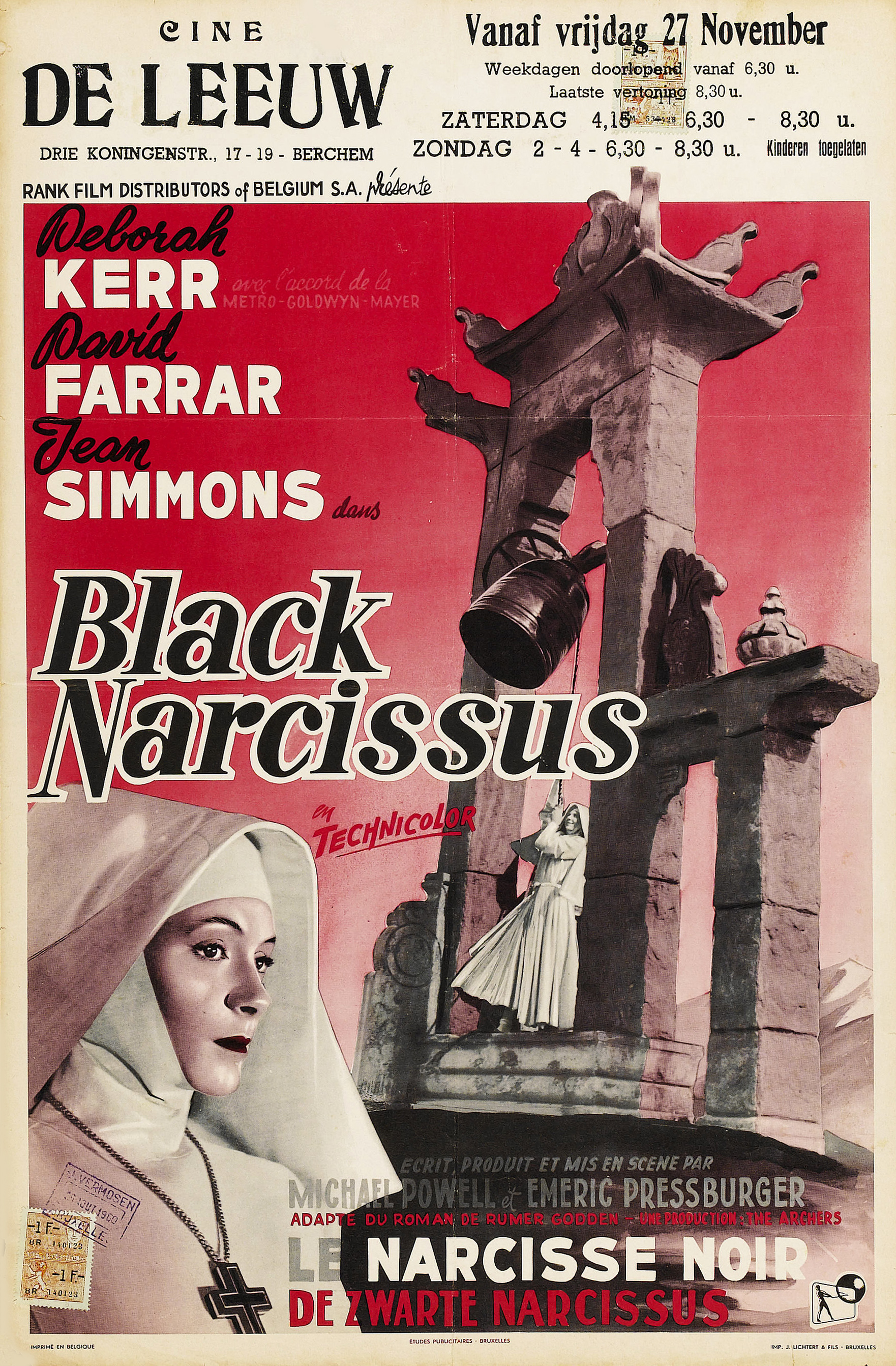
Fig. 1. Black Narcissus poster
Michael Powell & Emeric Pressburger’s Black Narcissus (1947) is a film that
was well ahead of its time, it has some amazing matte paintings and a plot that
will slowly build up until it gets out of hand.
Powell and Pressburger did a fantastic job at
creating a link between the viewer and the nuns, slowly you watch as they are
taken over by thoughts of lust and love that is expressed by flashbacks and
clever lighting. As Uhlich points out in his review ‘That great duo of stylized cinema, Michael Powell and Emeric
Pressburger, shot their classic dark-comic melodrama mostly on British studio
sets, and the film’s very falseness—those matte-painting vanishing perspectives
and cinematographer Jack Cardiff’s harshly exaggerated lighting cues—creates a
psychologically charged space in which an ungodly tragedy can unfold.’
(Uhlich, 2013). Uhlich suggests that due to how the film was shot mostly on
set, it creates a falseness that makes you as a viewer feel uneasy and connect
with the struggles that the nuns are facing. It is possible that Powell and
Pressburger wanted to create a space that is very alien to the viewer, to
strengthen the feeling that was consuming the nuns in the narrative. This is
achieved through the use of matte paintings and the use of red lighting, which
becomes more and more obvious as the film progresses.

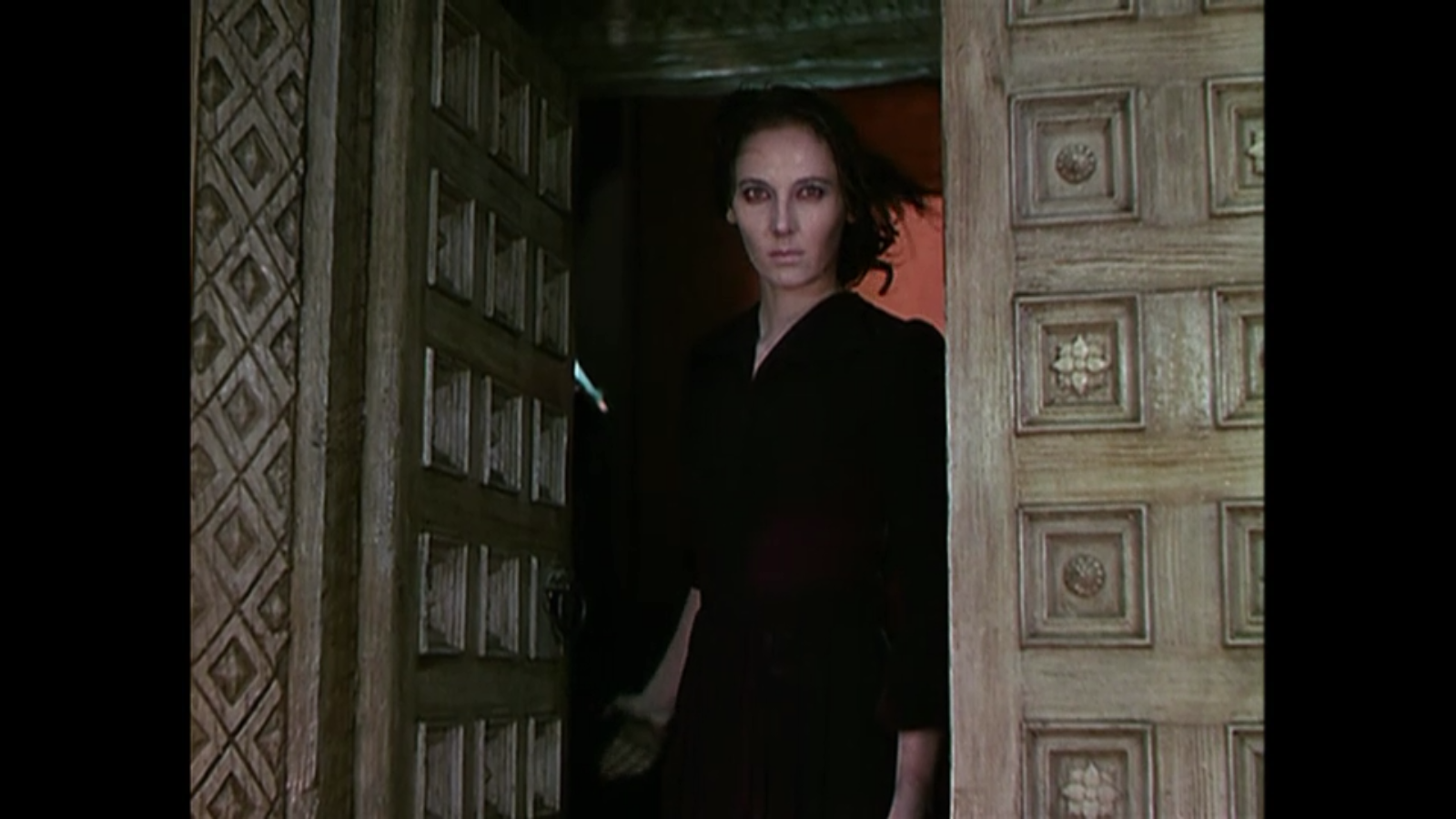
Fig. 2. Horror still
Black
Narcissus takes a dark turn when Sister Ruth’s lust takes
over. Throughout the film it is easy to see Sister Ruth’s transformation slowly
happening, however the final few scenes may still take you by surprise as the
film quickly becomes a horror story. As Kendrick points out in his review ‘She is established as “trouble” from the
beginning, and the numerous close-ups of her intense eyes and sly smile suggest
that the chastity of a nun’s life is not for her.’ (Kendrick, 2001). This
suggests through the use of close ups Powell and Pressburger attempted to
express the hidden desires of Sister Ruth. It becomes more apparent as the
story progresses that Sister Ruth becomes twisted by the lust she has, to the
point where she attempts to murder Sister Clodagh. These scenes have aged very
well, the framing of each of the shots where Sister Ruth is stalking Sister
Clodagh are visually stunning. Figure 2 shows the scene in which Sister Ruth
emerges from the doorway and attempts to throw Sister Clodagh off the cliff.
This looks incredible visually due to the fact she has been made to look almost
zombie like in this scene which is a huge contrast to what you have seen
throughout the film. It is also hugely successful due to its build up,
throughout this scene in which Sister Ruth stalks Sister Clodagh, the camera changes
a lot from close ups, to first person. This makes it still very easy to read as
a situation that is invoked with horror.

Fig. 3. Red lighting still
The use of the colour red is a vital element to the
story telling, it is a clear indication to the sexual temptation and lust.
Powell and Pressburger use the colour red in a variety of ways from the use of
subtle lighting to the more obvious scenes in which Sister Ruth is wearing red
lipstick and a red dress. As Brussat states ‘There is the sexual arousal of Sister Ruth who casts aside her habit
and puts on a red dress and thick red lipstick in her bid for Mr. Dean's
affections.’ (Brussat, 2010). Brussat suggests that the red lipstick and
dress is a visual embodiment of the sexual desire that Sister Ruth feels. It is
possible that Powell and Pressburger used these strong vibrant visuals to
suggest sexual tension subtly, with the addition to red lighting the viewer receives
a powerful sense of passion.
Overall Black
Narcissus is definitely a film that can still be enjoyed today; it has some
incredible visuals that will intrigue you from the start and a plot twist that
you’d never expect in a film about lustful nuns.
Illustration List:
Powell, M & Pressburger, E. (1947). Figure 1.
Black Narcissus poster. http://www.doctormacro.com/Images/Posters/B/Poster%20-%20Black%20Narcissus_10.jpg
(Accessed on 16/11/2014)
Powell, M & Pressburger, E. (1947). Figure 2.
Horror still. http://filmfanatic.org/reviews/wp-content/uploads/2011/09/Black-Narcissus-Horror.png
(Accessed on 16/11/2014)
Powell, M & Pressburger, E. (1947). Figure 3.
Red lighting still. http://www.seraphicpress.com/wp-content/uploads/2011/12/sister-ruth.jpg
(Accessed on 16/11/2014)
Bibliography:
Brussat, F & M. (2010). spiritualityandpractice.com.
http://www.spiritualityandpractice.com/films/films.php?id=20119
(Accessed on 16/11/2014)
Kendrick, J. (2001). qnetwork.com. http://www.qnetwork.com/index.php?page=review&id=2412
(Accessed on 16/11/2014)
Uhlich, K. (2013). timeout.com. http://www.timeout.com/us/film/black-narcissus-3
(Accessed on 16/11/2014)
Subscribe to:
Posts (Atom)