Thursday 31 March 2016

Adaptation B - Pop Princess Rigging Progress #2

The leg rig is finally finished and I will now be moving onto the arm rig, it took quite some time to get used to using expressions and the node editor however the result is very rewarding. Once skinned I will make some playblasts of the rigs features, it has been very interesting to create so far!


The left side of the Node editor deals with making the leg stretchy correctly, it took a while to set up and to learn how each node worked. The right side deals with the flexiPlanes ability to twist successfully with the rig, it seems like the flexiPlane will be useful for keeping volume in the mesh as it deforms and creating some nice stretching/twisting.

the tutorials can be found here

Tuesday 29 March 2016

Adaptation B - Pop Princess Rigging Progress #1

I decided that I wanted to try something different from Alans tutorials for rigging, so I started a course on digital tutors called advanced character rigging. So far it has been pretty straight forward and I have picked up some useful scripts and tips that should make rigging slightly easier in the future (hopefully), this rig uses a lot of flexiPlanes which are very similar to the ribbon spine, although it seems to be slightly more detailed.

Here is a playblast of the flexiPlane bound to a low res cube, it has lots of squash and stretch potential and the ability to turn that attribute on and off, also as the flexiPlane is a modular component it only had to be made once and can be added to the rig multiple times.


I am currently working on the leg rig which has the option to switch between IK/FK, so far it is going quite smoothly but there is a long way to go yet.


The course doesn't include facial rigging so I will have to combine it with another course to have a complete rig, I am excited to bring my character to life.

http://www.digitaltutors.com/tutorial/879-Advanced-Character-Rigging-in-Maya

Saturday 26 March 2016

Adaptation B - Pop Princess UV Layout


I spent some time laying out the UV's for the model, These may need adjusting but it is a good base to start with. I am still deciding how i want to paint my textures, if I will use applications like Mari, BodyPaint, Zbrush, etc or if I will go straight into Photoshop.

Thursday 24 March 2016

Adaptation B - Pop Princess Model Complete


I finished off the model today and will start UVing her next, I want to try to get through UVing as quick as possible so I have more time to focus on rigging as I feel it is my weakest area.

Tuesday 22 March 2016

Adaptation B - Pop Princess Modelling Progress #8


I finished off the arms, hands and shoes of the model, all thats left is to model the accessories and then I can move onto UVing.

Sunday 20 March 2016

Adaptation B - Pop Princess Modelling Progress #7


The body geometry has been blocked out, i've tried to keep the faces as even as possible, however some adjustments still need to occur. The character is definitely starting to come together, looking forward to finishing her model.

Tuesday 15 March 2016

Adaptation B - Pop Princess Head Model


In today's tutorial Alan gave me some advice on how I could attach the braids to the hair mesh which was something I was having some trouble with. After I got over that hurdle I moved onto the eyebrows and eyeball, I think she is looking quite cute which is what I was aiming for.

I need to model her bow next and then I can move onto the torso, she is slowly coming together.

Sunday 13 March 2016

Adaptation B - Pop Princess Modelling Progress #6


I started working on the hair mesh for the character, here is how it looks at the moment, it needs adjusting still but I think it's along the right tracks.

Saturday 12 March 2016

YPGTTO Speed Paint Challenge 6 : The Violin District


Adaptation B - Pop Princess Modelling Progress #5


I moved the eye sockets forward and added the ear to the character, as this character is intended for a game I decided to create triangles on the top and bottom of the ear instead of having diamond shaped quads, I think that was the right choice as it helps with the deformation.


I then added the neck and throat to the character, the throat as it is at the moment might be a bit overkill as the character isn't going to open its mouth very wide. Next up is the hair, this will probably take a bit of time to figure out.

Friday 11 March 2016

Adaptation B - Pop Princess Modelling Progress #4


She no longer looks like an alien (woo), today I did the eyes and nose, I think the nose went pretty well and I think she is starting to look cuter. The eyes need some more work as they are a bit too deep in the skull, so tomorrow I will pull them forward and adjust the geometry accordingly.

Thursday 10 March 2016

Adaptation B - Pop Princess Modelling Progress #3


I added some more geometry for the mouth and now she has lips, slowly getting through the head, it is still a bit lumpy in place so I will need to adjust that.

Adaptation B - Pop Princess Modelling Progress #2


Added some more geometry and started to clean up the mesh, this is how she is looking so far. The mouth is next part I will start working on.

When the Wind Blows Film Review


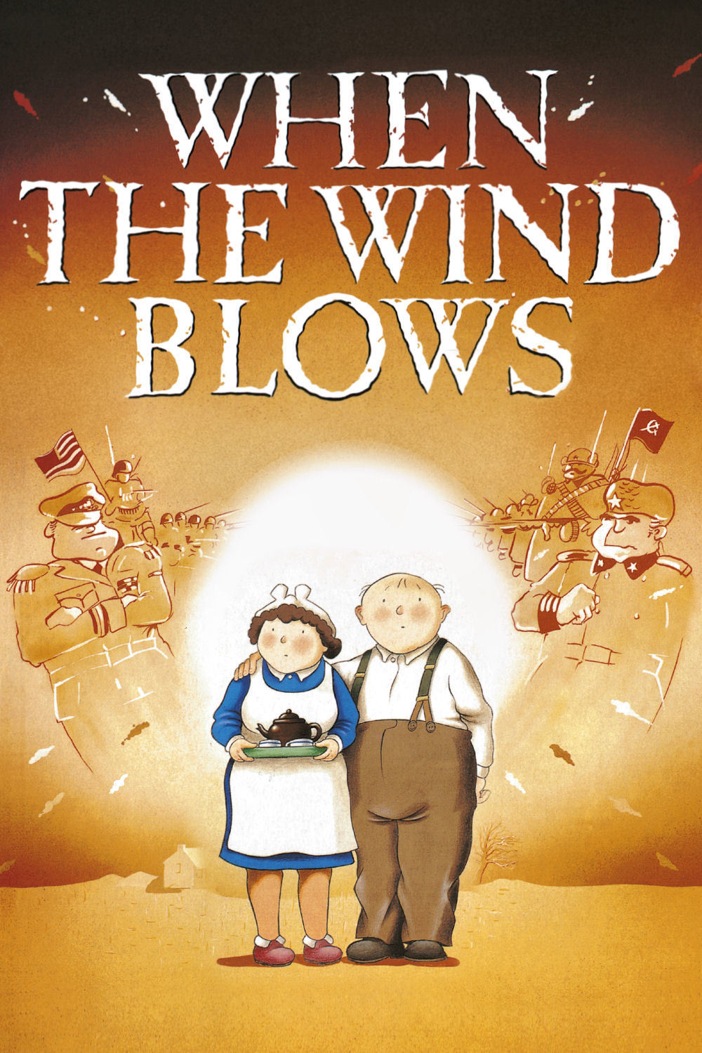
 Fig. 1. When the Wind Blows poster

When the Wind Blows (1986) is an animated film directed by Jimmy T. Murakami who also directed The Snowman, it features the story of an old couple who are preparing for an impending nuclear attack from Russia. The film largely 
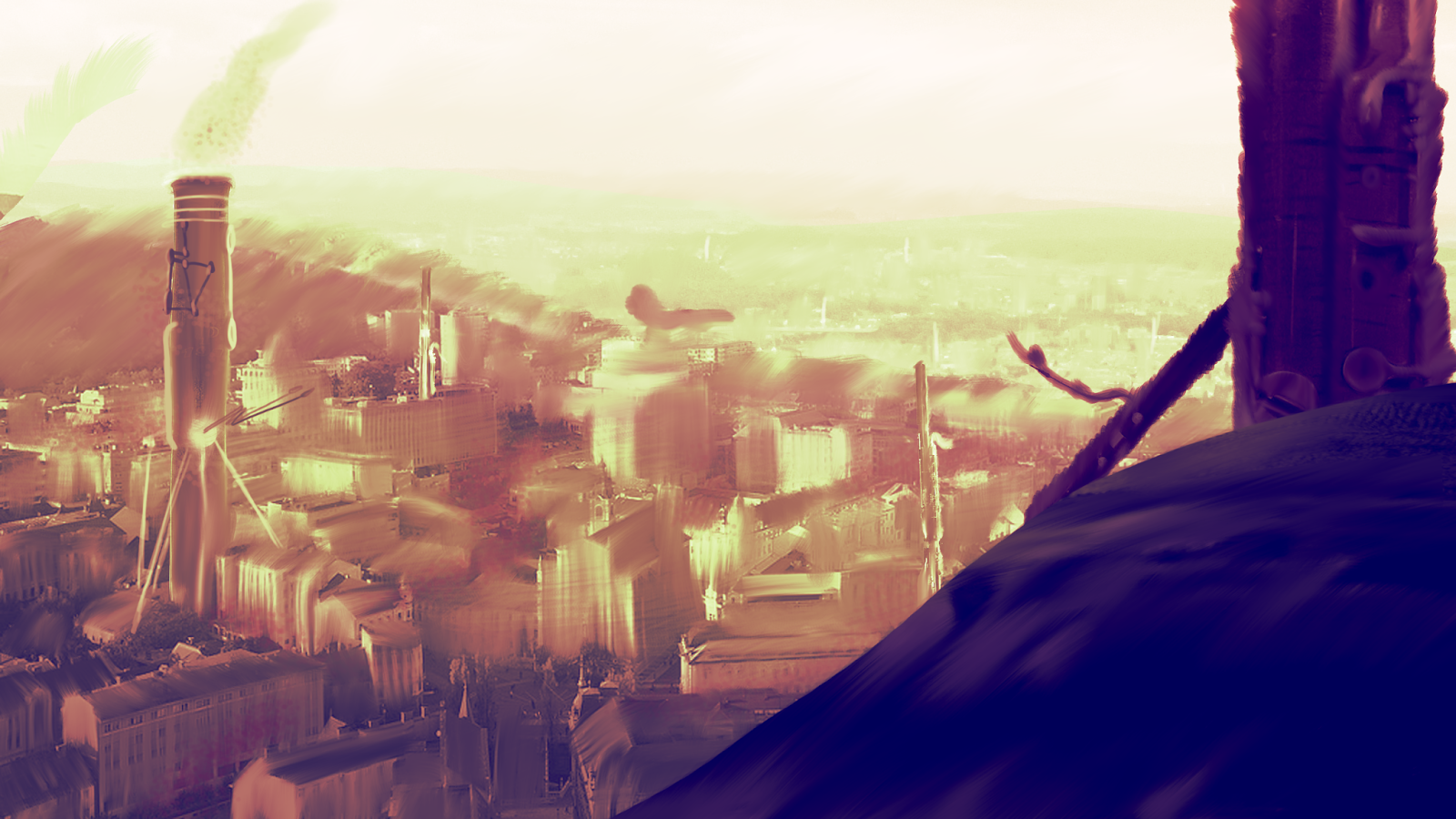
takes place in the couples house as Jim, the man of the house attempts to follow a government pamphlet with directions on how to survive.


 Fig. 2. Jim and the pamphlet

The film attempts to be humorous throughout as the old couple are following directions from a pamphlet on how to build a shelter and survive, they bicker and make funny comments, Hilda was more worried about her curtains and pillows than her own safety. As the bomb is about to hit Hilda wanted to go and get the washing in, however at this moment Jim began shouting and swearing which completely changed the tone of the film. At this point it all became more real, the comedy then appeared to be more twisted and sinister as the couple had to carry on trying to survive. It was then that the film became tense and uncomfortable as the audience was then left to watch the couple’s health slowly decay.

The film did have some funny moments which made the first half seem slightly more light-hearted, there was a scene in which Jim was comparing two pamphlets on how to survive and they both gave different information, this could be seen as the indication that there wasn’t any hope. At other times as Jim was talking to Hilda he kept getting the current situation mixed up with the second world war, a gag that is replayed throughout the film, it could be said that the similarities of each situation made them appear as if they were the same, or it could simply be that Jim is old and cannot remember what is happening, either way the film is clear that hope keeps a person strong, even though in reality there was never any hope to begin with.

The aesthetic of the film was quite charming and in scenes of flashbacks it was very beautiful, this made the whole film more watchable as it was welcoming it its aesthetic. The film arguably most powerful scene was when the bomb went off, it was monochromatic making it stand out and feel intense compared to the rest of the film. The film also mixed 2d animation with stop motion animation which at times worked quite well, however a few scenes felt a bit clunky such as when they were moving the cover or getting in the potato sacks.

Overall I found this film quite difficult to watch, it was emotionally powerful which made it quite uncomfortable at times, watching someone struggle in a hopeless condition was a challenge however the overall film was good. The ending was very strong and the build up to it was very moving, not a film I would recommend for emotionally weak people. The aesthetic was an enjoyable factor of the film as was the first half with its comedy, it is focused on a strong subject and it tackles it in a way that sends chills down your back.

Illustration List:
Figure 1. When the Wind Blows poster. (2003) From: When the Wind Blows, Directed by: Jimmy T. Murakami [Film still] At: http://www.chud.com/wp-content/uploads/2015/11/When-the-Wind-Blows-Poster.jpg
Figure 2. Jim and the pamphlet. (2003) From: When the Wind Blows, Directed by: Jimmy T. Murakami [Film still] At: http://s3.amazonaws.com/auteurs_production/images/film/when-the-wind-blows/w856/when-the-wind-blows.jpg


Wednesday 9 March 2016

Adaptation B - Pop Princess Modelling Progress #1

I started blocking out the head for the Pop Princess today, I am feeling a bit rusty in Maya but I think I should get back into the swing of it pretty quickly. Before I started blocking out the head I had to fix the orthographic a little bit so that it had an accurate center line.

 Adjusted Orthographic

Head Blocking

Adaptation B - Pop Princess Concept Art


I'm quite pleased with how this turned out, next I will be moving onto the modelling!

Monday 7 March 2016

Adaptation B - Pop Princess Concept Art WIP


Lots still to do for this piece, I need to add a background more details and shading but it is going alright so far. In the final image I aim to have lots of sparkly stuff happening in an attempt to make her look super cute, after this is done I will be ready to start work on the modelling, excited to get it all into 3D!

Maya Tutorials - Dynamics Part `17 - Sprites


I think I will definitely be using sprites for parts of my adaptation B animations, I'm interested to know if it is possible to have different sprite images on the same particle system. I want to use these to have stars and hearts explode from the pop characters attacks, just to make it even more sickly.

Saturday 5 March 2016

Adaptation B - Pop Orthographic

I did the orthographs for the pop character today so that next week I can start modelling her, I am super excited to get her finished and ready for animation.

Friday 4 March 2016

Adaptation B - Pop Hair


I started trying to figure out the mesh for the characters hair, I think it is important that I solve how to model the mesh early so I will be more prepared when I start modelling.

YPGTTO Speed Paint Challenge 4 : The Clarinet District


First attempt at photobashing in an attempt to actually make this into a speed paint, lots I can improve on but was good to practice something new.

Thursday 3 March 2016

Adaptation B - Pop Colour Comp #2


I did some more colour variations, trying to make it as sickly as possible, I think E is the most successful and I think I need to work on her eyes, some design around whether they should have pupils and if the pupils should be normal or perhaps heart shaped, star shaped, etc. So next I will start working on that and after that I would like to do some concept art for her in a nice pose, followed by orthographics.

Maya Tutorials - Dynamics Part 15 - Goal Weights


This was lots of fun to do and I think the goal weights will be really useful when dealing with particles in the future.

Belleville Rendez-vous Film Review

Fig. 1. Belleville Rendez-vous poster

Belleville Rendez-vous (2003) directed by Sylvain Chomet is a French animated comedy that tells the story of a cycling obsessed man that is kidnapped by the French mafia during the Tour de France, his Grandmother and overweight dog track him down in an attempt to save him. The film has incredibly over exaggerated characters that really make it memorable and interestingly it has hardly any dialogue which allows the brilliant sound design and animation to tell the enticing story.

The exaggerated character design is truly a winning feature of the film, from the Champion that has ridiculously massive leg muscles, which are in fact larger than his head to the fluid-like waiter that has an elasticated body which bends to bow in the presence of the mafia. Each character was filled with lots of personality and finesse that really made them come to life on screen, the design although very caricatured was gripping, it was the focal point that helped the story unfold. Even the cannon fodder characters, the mafia men in suits had interesting shapes in them that made them more interesting to look at, this is definitely a very strong feature of this animation which made it interesting to watch.

Fig. 2. Champion still.

The film was very French but not in an over the top kind of way, it was quite subtle in its execution, it could have been more in your face with extreme stereotypes being used however it managed to create a French feeling without being too over the top. The Champion has an overly exaggerated French nose but because the rest of his character is also exaggerated it balances his design out which doesn’t make it too extreme. The frogs are something that was a very obviously French aspect but apart from that I felt that Chomet did a great job at creating a subtle yet recognisably French film.

The film had little to no dialogue which was a very interesting choice, one which I believe worked really well, it left the animation to do a lot of the work which overall meant that it was done very well. It also had beautiful sound design which made the whole film enjoyable to follow, from the catchy song that the triplets did to the great score composed of household items. A lot of the transitions for the shots were also interesting, they used Bruno’s (the overweight dogs) dreams as transitions as well as having certain circular things transition into the moon. Due to the character design choices the animation also had to be exaggerated at times to make the film feel complete.

Overall I thought that it was a lovely animation, it was very enjoyable to watch and had lovely sound design. The character were the winning feature of the film for me personally and I loved the variety in all of their designs, the exaggeration made them all interesting to look at and made the film more gripping and fun.

Illustration List:

Figure 1. Belleville Rendez-vous poster. (2003) From: Belleville Rendez-vous, Directed by: Sylvain Chomet [Film still] At: http://i.imgur.com/TGXlwTX.jpg

Figure 2. Champion still. (2003) From: Belleville Rendez-vous, Directed by: Sylvain Chomet [Film still] At: http://pics.filmaffinity.com/The_Triplets_of_Belleville-508681482-large.jpg

Wednesday 2 March 2016

Adaptation B - Pop Colour Comp


I wanted the Pop Princess to be overly cute to the point where it makes you feel a little bit sick. So I tried to put as much pink into her colour scheme as possible, B and C are my favourites at the moment, i think the light blue in C works nicely with the pink.

After my tutorial with Alan it was decided that I would be taking the pop character forward as the character that I will model, rig, texture and animate the game cycles for.

Adaptation B - Rap Thumbnails 5 - 7

I did a few more thumbnails for the rap character, 6 is my favourite so far, I tried exaggerating the neck chain and the amount of watches he wears.